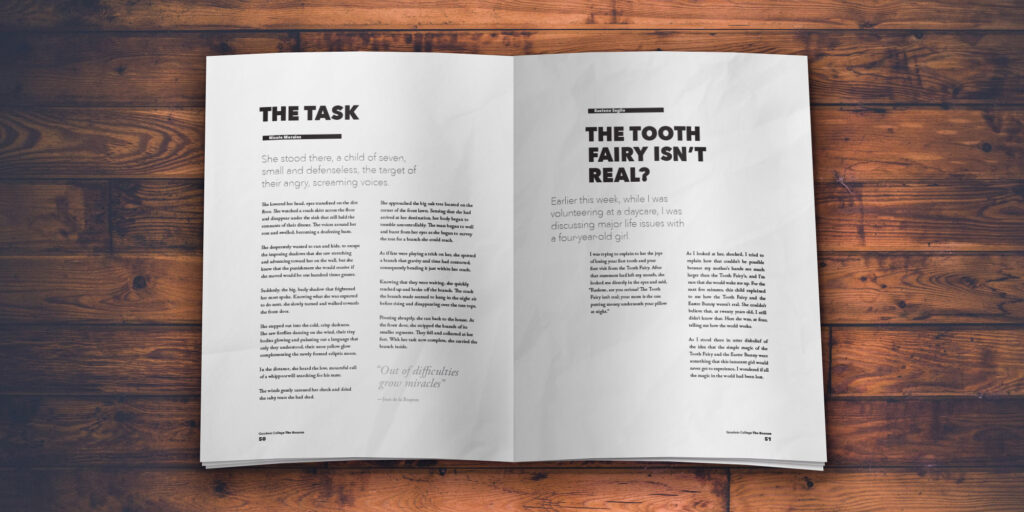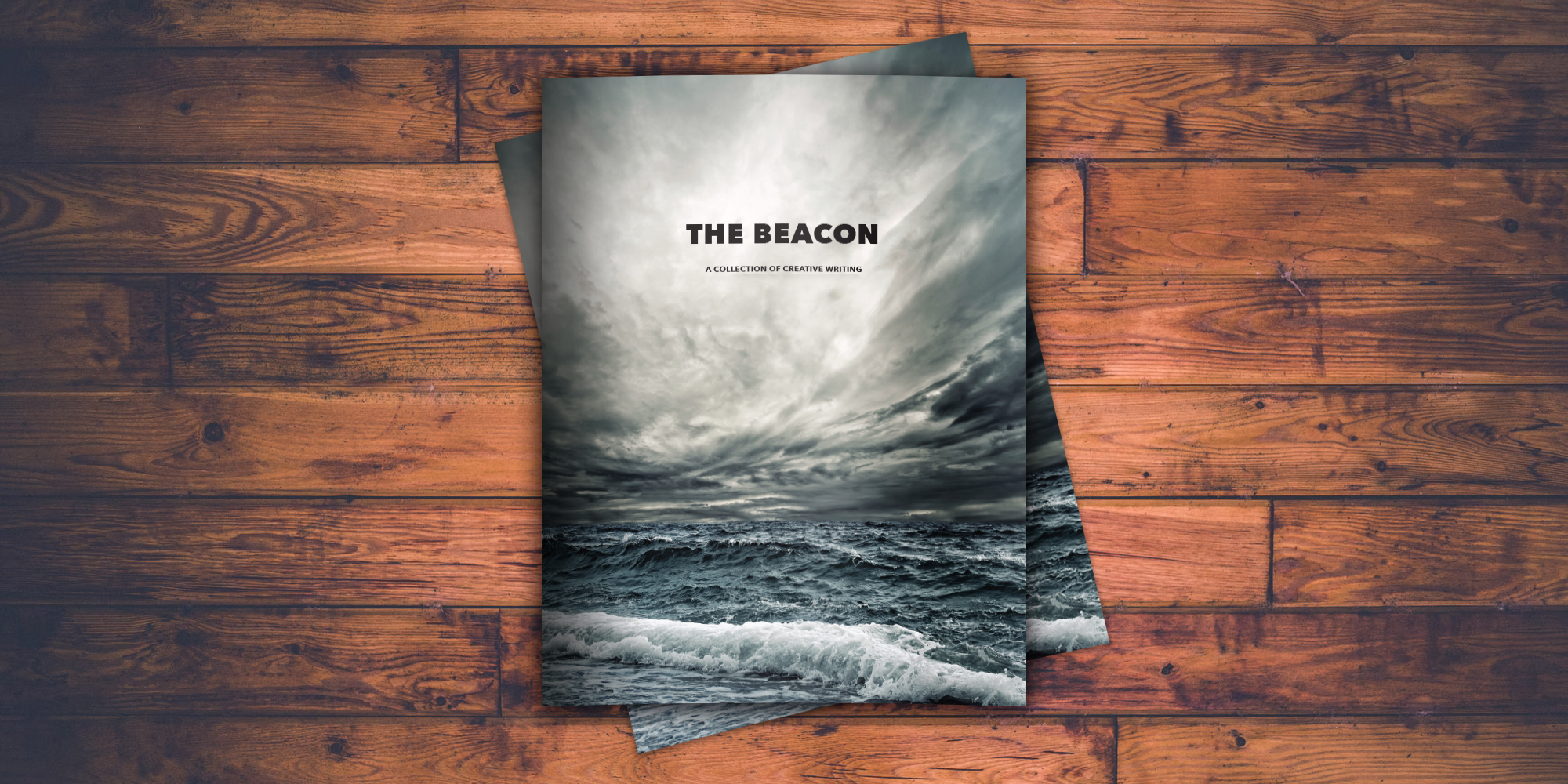
This journal of creative writing showcased a broad selection of works curated by an editorial committee. The biggest challenge was establishing a layout and typography system that could showcase short stories, poems, scripts, haikus, and longer narrative pieces — each of widely varying lengths — in a way that felt cohesive, yet allowed each piece to shine and maintain some individuality.
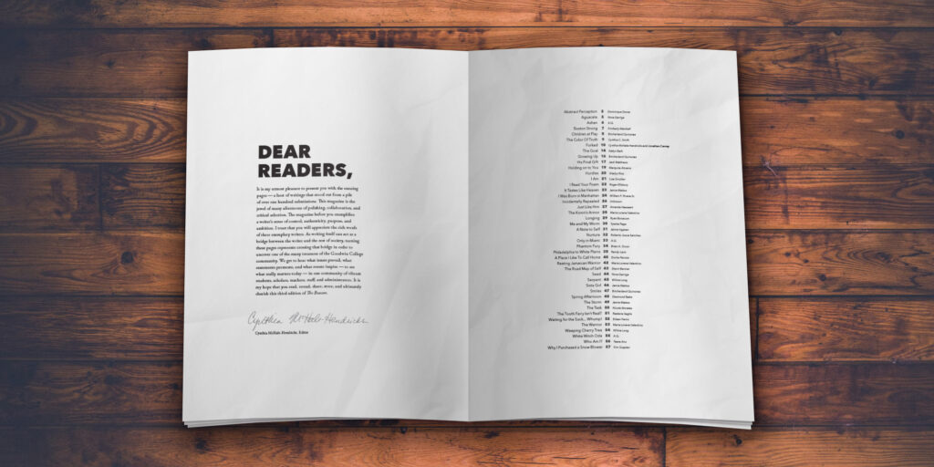
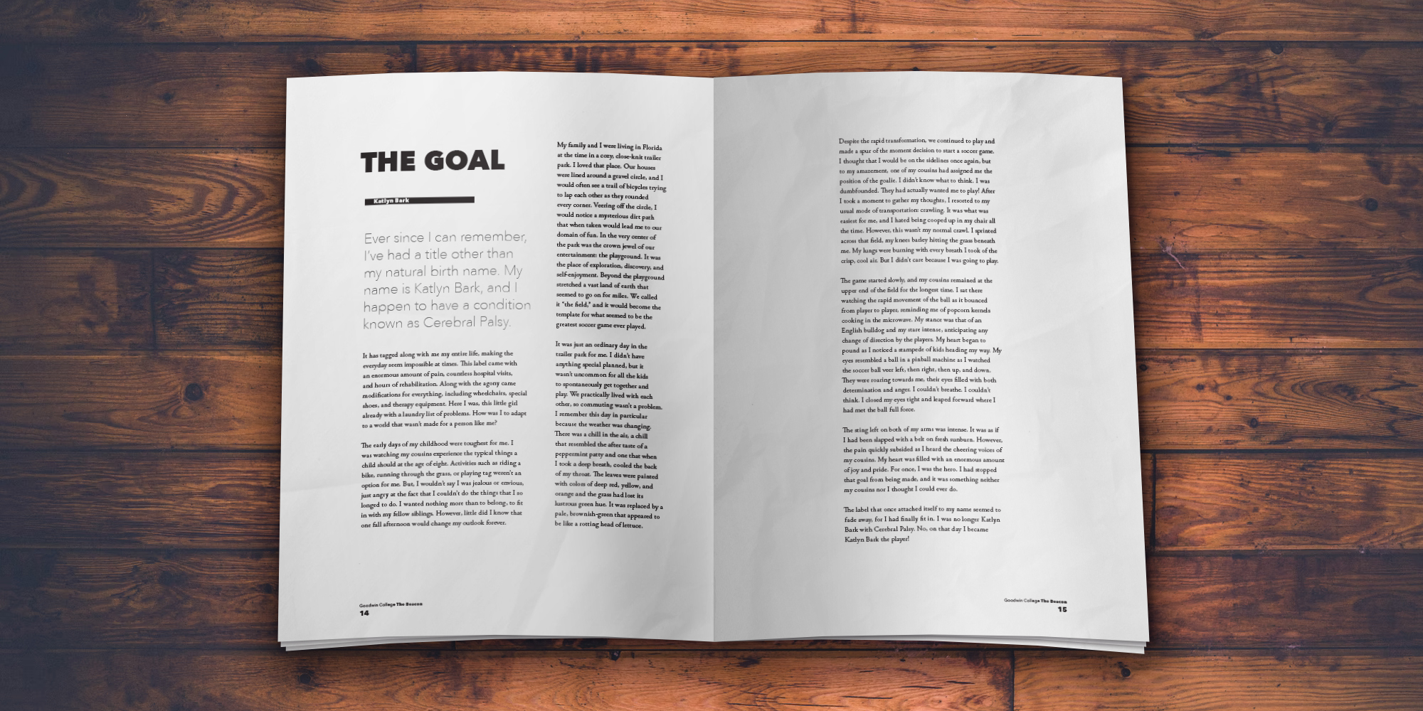
Big chunky bold headings and ample white space throughout each spread keep the focus on the writing, with the only image used in the entire piece being the one on the front cover.
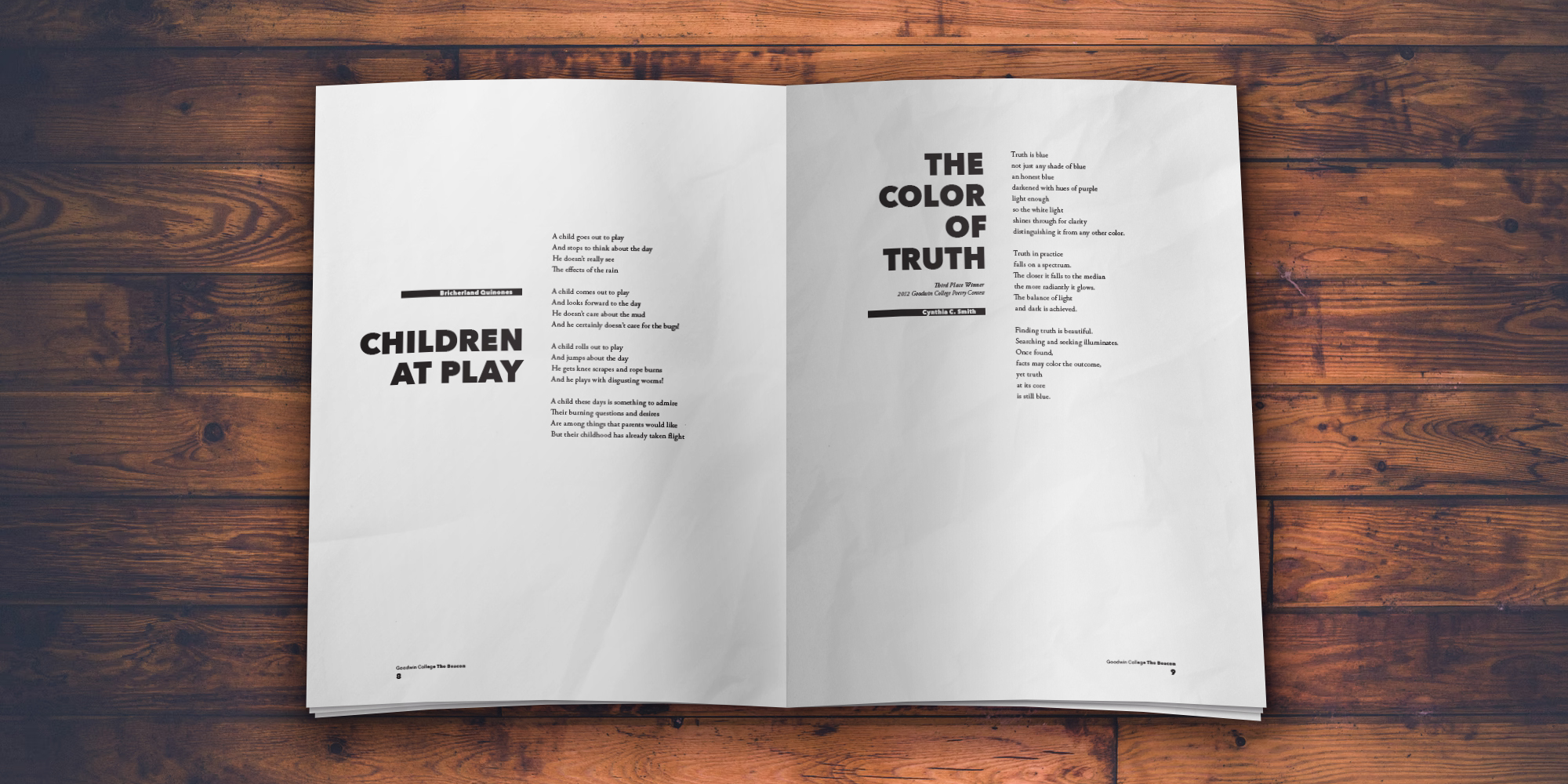
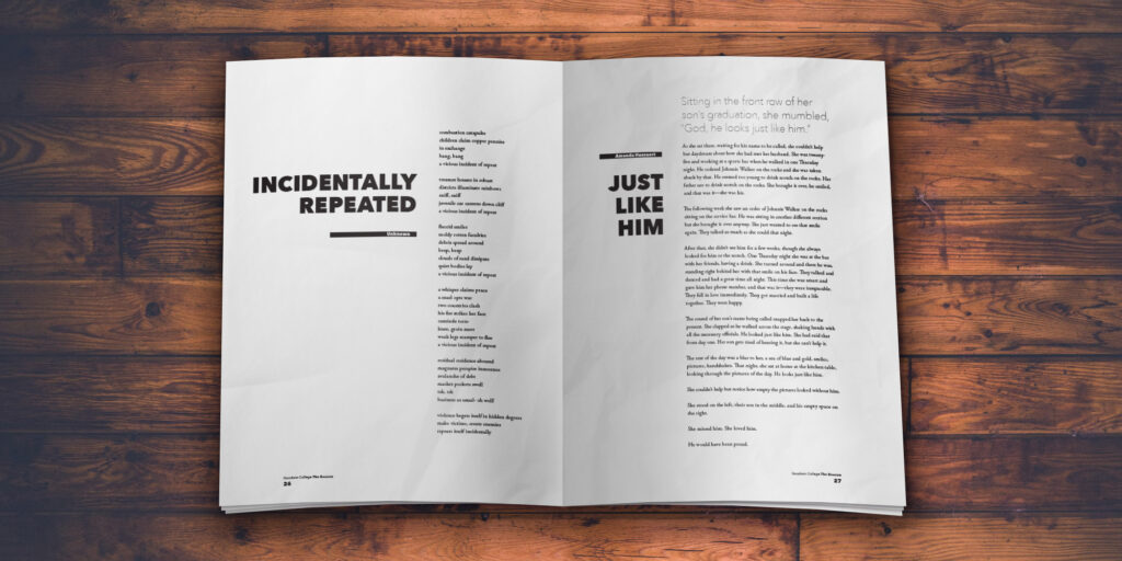
Interspersing shorter pieces in between the longer ones allows for lots of layout variation, and keeps the spreads from feeling repetitive or boring.
