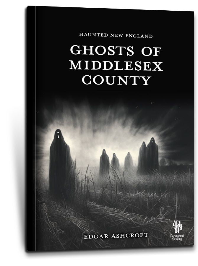
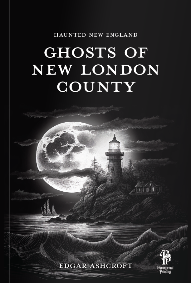
The cover is one of the most important aspects of book design
It’s critical for the book cover design to catch the audience’s eye, set expectations for the content inside, and be memorable. This is even more important with so many books being sold online, where each cover only gets a miniscule amount of screen space.
For this book series, we leveraged the same dark and mysterious illustration style used inside the books to project the appropriately creepy tone and create an image that works well at small sizes and sticks with the viewer.

Designing a consistent look for the book series
Each book in the “Haunted New England” series focuses on a different county, and features a town-by-town look at haunted places, ghost stories, and mysterious tales of the unexplained.
Defining a consistent style that could be replicated across the titles, while retaining enough flexibility to accommodate many different types of stories of varying length was essential.
Designing the interior of the books
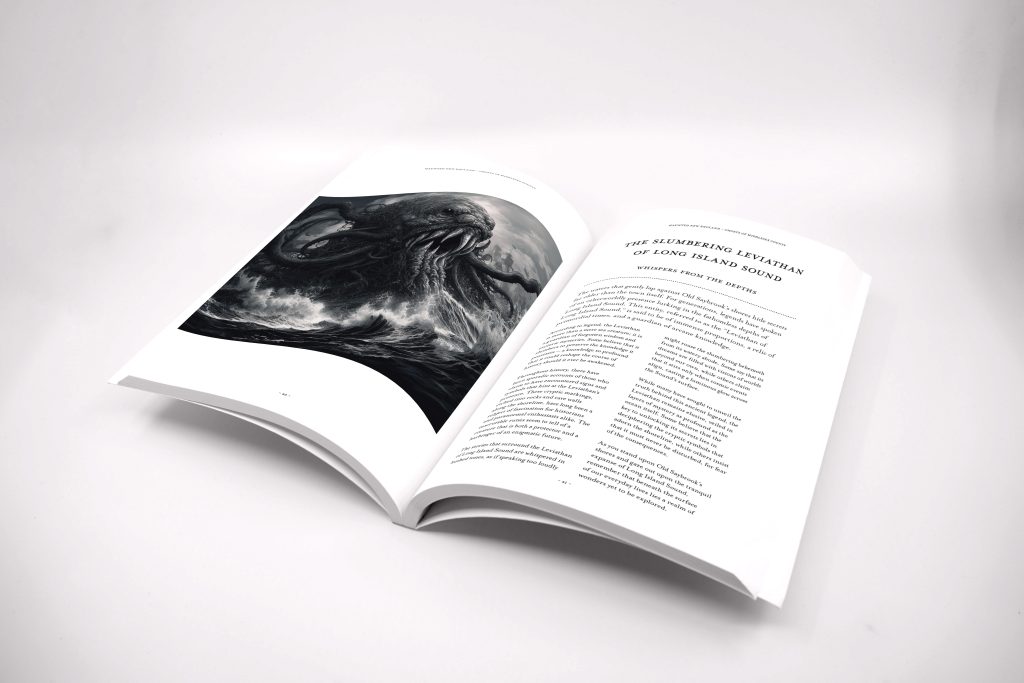
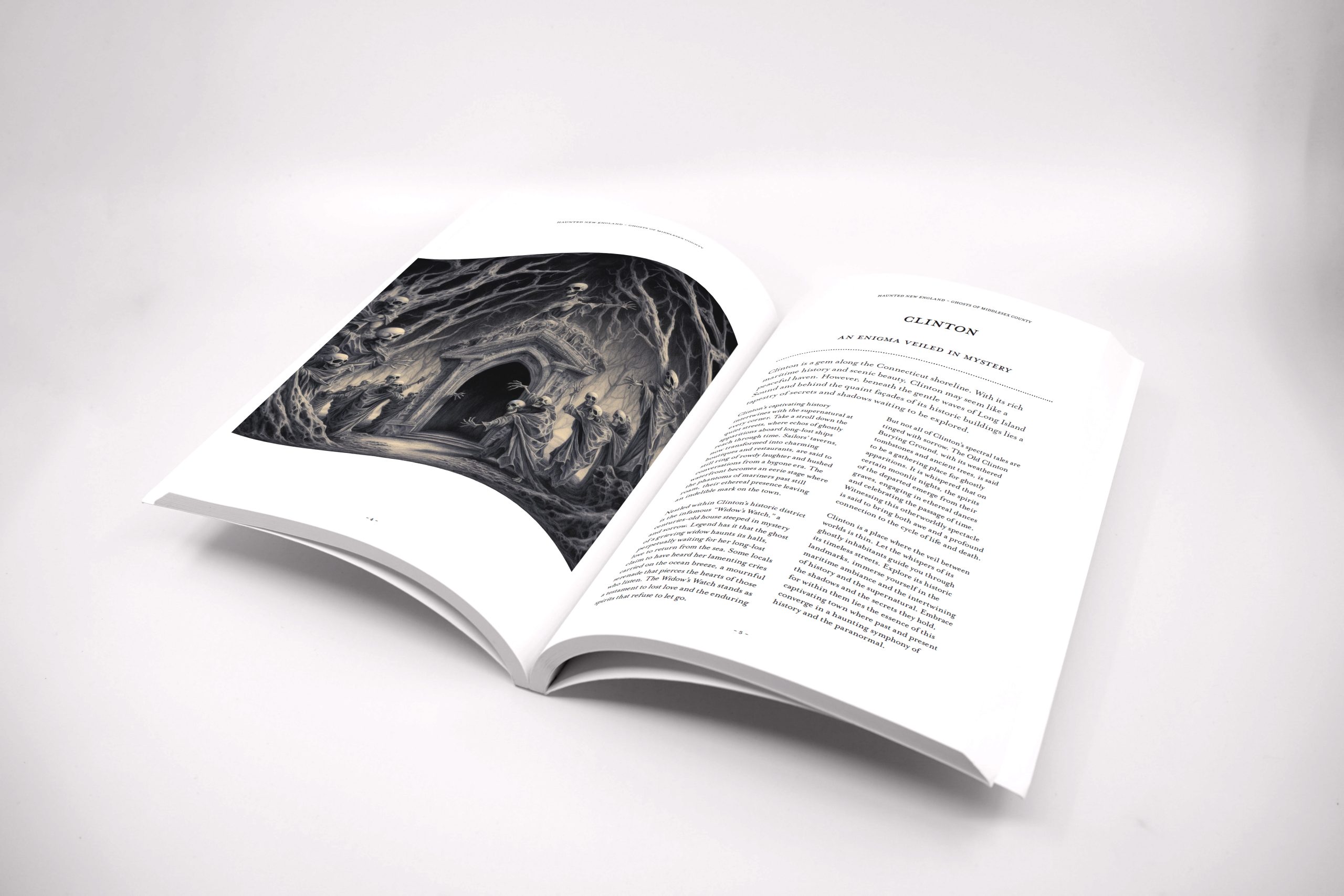
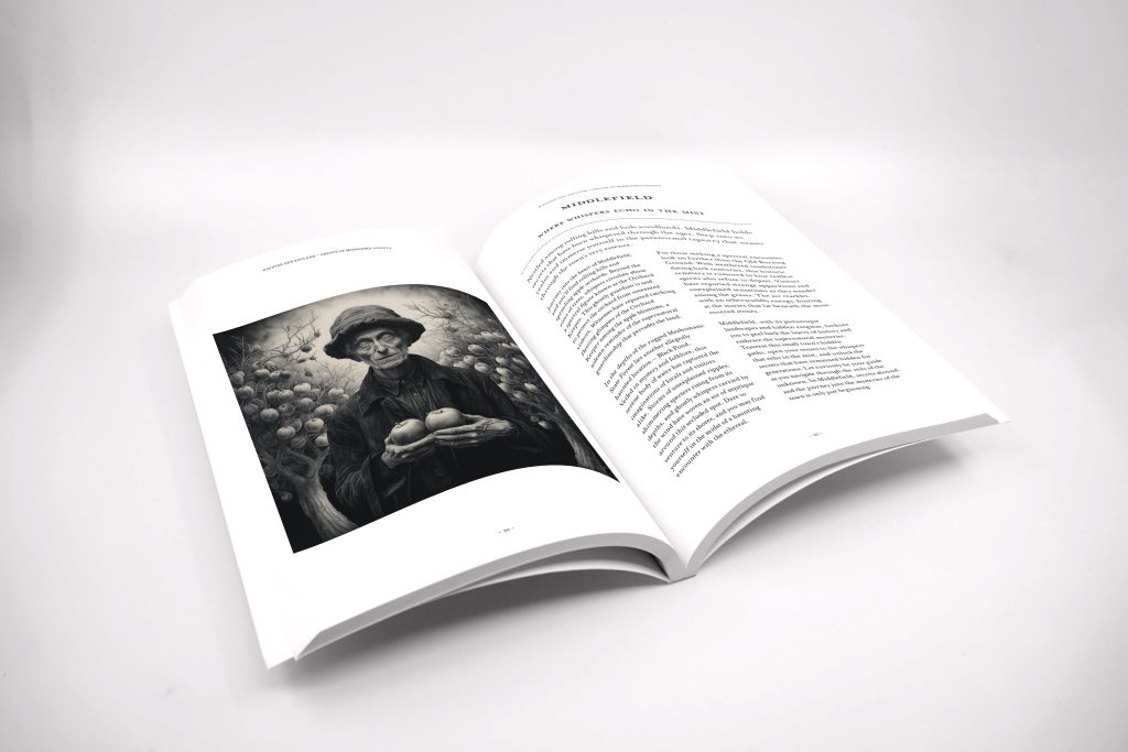
Within, each section pairs the text content against large, creepy, black and white illustrations that bring the ghost stories and tales of the paranormal to life.
Typography choices were made to lend the book an authoritative and historic feel. The serif font used throughout draws the reader back into the past and imbues the tales within a weight of greater significance and air of mystery.