The IMK Creative logo is bold, angular, and designed to be noticed. The logo’s emphasis is on the power of words, with additional layers of meaning hidden between the lines.
Both working ends of a pencil appear in the negative space within the “m” calling back to the most basic of writing implements and the end-to-end process of writing and editing provided by a full-service copywriter.
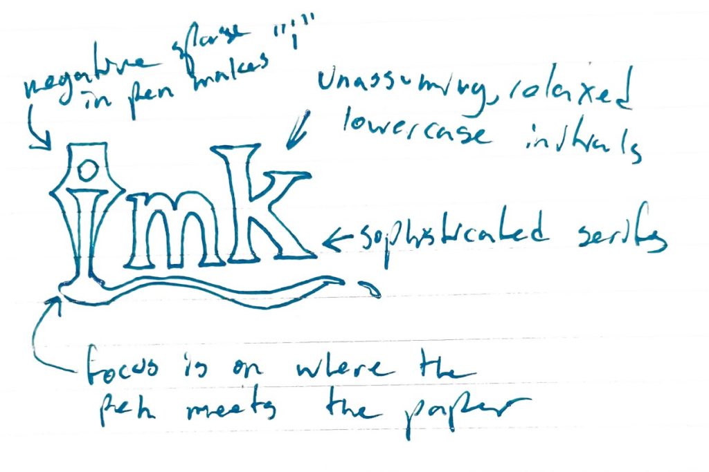
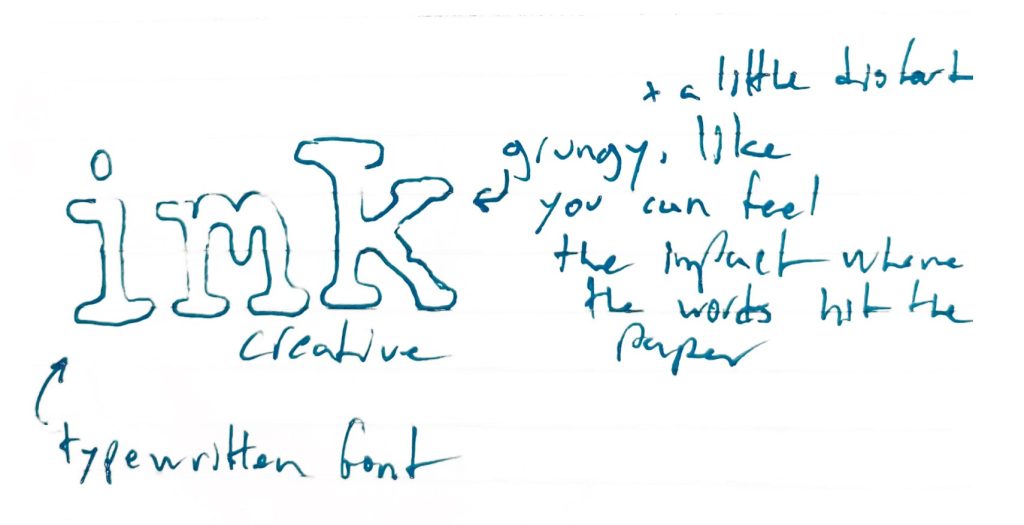
Sketching the initial logo design concepts
For this project, I was approached by a former colleague with a request to help shape her identity as she launches her creative and copywriting brand.
After an initial meeting, the first step was to capture early ideas in the form of rough notebook sketches.
The goal at this stage is to get as many visual ideas and notes down as possible. Not all of them end up in the finished product, but this early ideation and exploration is an essential part of the creative process.
“Caleb is an attentive, strategic partner with some serious skills. The moment I knew I needed a kind and creative consultant for my brand, IMK Creative, it didn’t take long before Caleb came to mind.”
Irene Marie Kennedy
Crafting a meaningful logo color palette
The color palette was developed to emphasize high-contrast black and white, referencing the power of the printed word and ensuring impact and visibility.
A pair of secondary colors brings in several softer shades of grey, adding dimension and nuance.
INK
rgb: 0/0/0
cmyk: 75/68/67/90
hex: #000000
PAPER
rgb: 256/256/256
cmyk: 0/0/0/0
hex: #ffffff
SMOKE
rgb: 24/25/23
cmyk: 73/66/67/79
hex: #181917
HAZE
rgb: 232/232/232
cmyk: 8/6/6/0
hex: #e8e8e8
Thoughtful typography maximizes a logo’s impact
The font that appears in the IMK Creative logo is Tilt Warp. For usage beyond the logo, a thoughtful pairing was created, combining Tilt Warp with the secondary font Neuton.
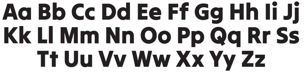
Primary font: Tilt Warp
Tilt warp is big, chunky, and bold, making it great for things like headings, but total overkill for anything like body text.
Secondary font: Neuton
Neuton’s slick serifs are not only easier to read in longer passages, they also provide a nice classical contrast to Tilt Warp’s modern clean lines.
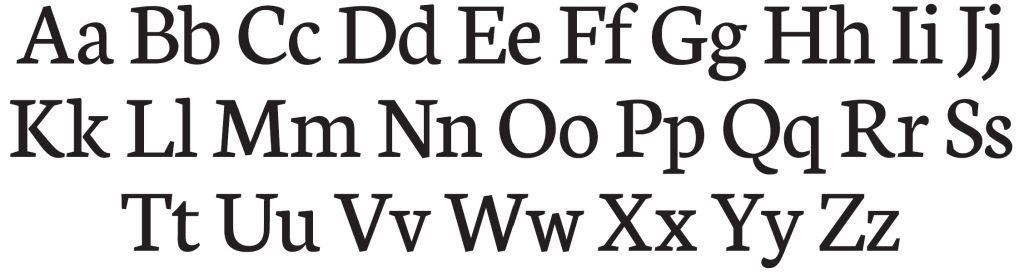
Both fonts have tons of style on their own, but like all timeless combos — putting them together brings out the best parts of each.
Both fonts are also available for download via Google Fonts (this means it’s easy for the client to grab another copy if needed, but more importantly they can be embedded on the client’s website to maintain consistent brand identity across the web).
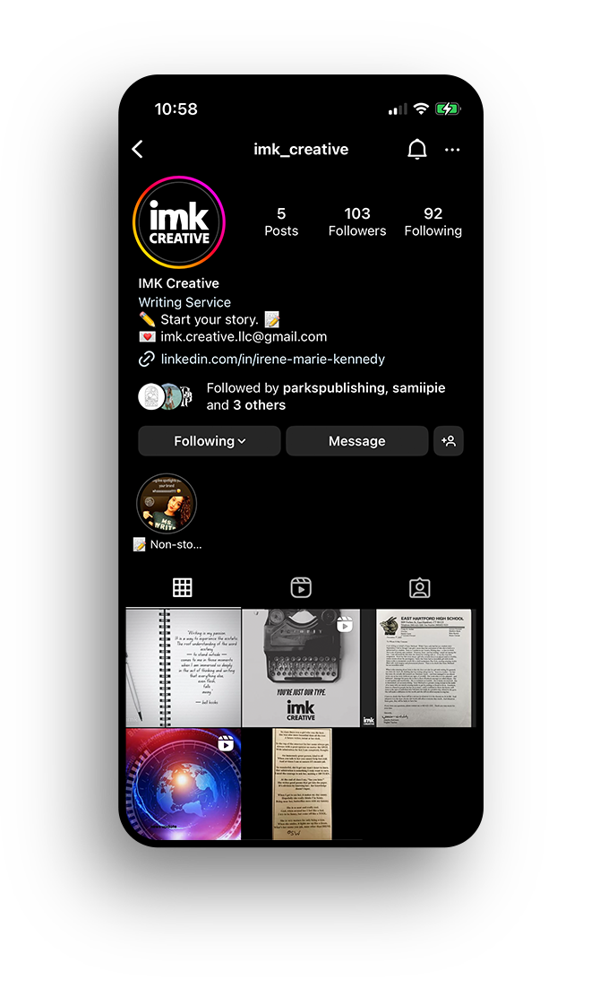
See the final logo design in action on social media
And you should follow her too at: @imk_creative
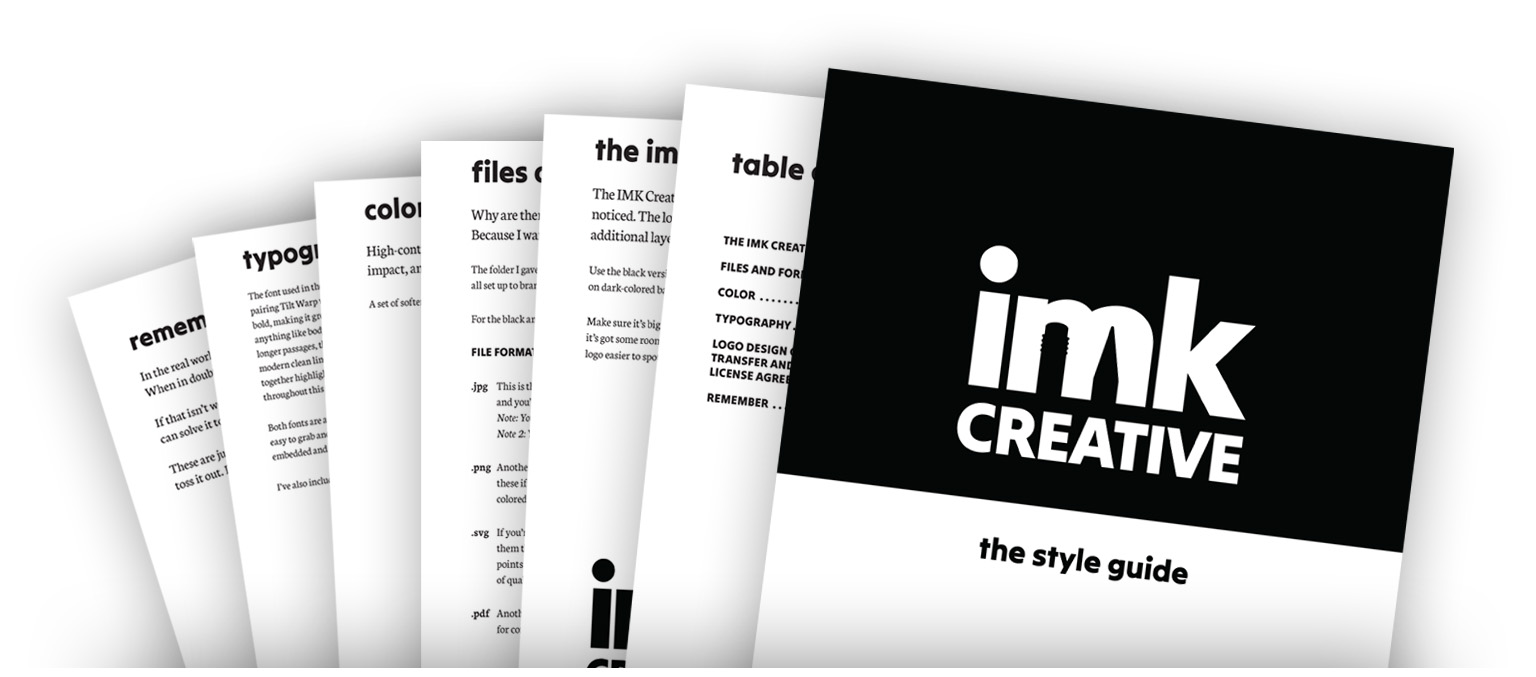
Wrapping up the logo project with style guide development
The final step was to put together a detailed style guide document with easy-to-implement guidelines and advice, including:
- Guide to file formats and tips for when and where to use each
- Typography and color palette breakdown
- Best practices for logo placement and sizing
“Caleb went above and beyond for IMK Creative, and I’m still smiling about it. His personalized dedication to my brand polished my woman-owned small business and prepared me for any IMK Creative design questions that may come next.”
Irene Marie Kennedy
Learn more about IMK Creative here:
https://www.linkedin.com/in/irene-marie-kennedy/